RECR 200 - Week 5
Week 5
Building Infographics
Introduction
We each have learning preferences. Specifically, we each prefer to learn topics differently. For example, I am a visual learner and I would much rather look at a picture, graph, or demonstration rather than read text. Usually if I am wanting to learn a new skill I go to YouTube or Lynda.com and watch the video. I recently learned how to set up a local server on my Windows computer using Lynda and had a lot of fun learning. This is not to say that text-based learning is wrong or not ideal, rather what I am suggesting is that there are more options to presenting information than text-only.
Infographics are a way to present text-based and numerical data in a more easily-understood and "friendlier" method that will most likely appeal and be understood by more people. You might already be familiar with infographics and have seen them online or in print. One of the first infographics I remember seeing was in the USA Today newspaper. Each weekday morning there was a graph in the lower left or right side of the front page that had a small survey statistic, like how far people travel for summer vacations. Here is an example of the USA Today infographics.
After reviewing the course surveys you completed at the beginning of the term, I noticed that most everyone is a junior or senior, which means you are most likely familiar with statistics. When I was a professor in recreation and sport management, I used to teach the dreaded statistics and research methods courses. It's not everyone's favorite, however, statistics can be quite fun and one of the areas where it is fun is with infographics. Statistics are everywhere and they are also misrepresented quite freqently in magazines, newspapers, online sources that seem reputable, and even by our friends and family. One common statistic I hear from a variety of sources, is that 50% of marriages end in divorce. This statistic is still mentioned, and it has not been true in decades. Alas, this is not a research methods course, however, this week we will be doing what I like to call "statistics light" and representing data visually (also called data visualization or data viz if you're a cool kid).
The Weird World of Infographics
As a former researcher, who took a bazillion research methods, data analyses, and statistics courses I look at the world through the lens of a researcher. When I see an infographic, which are usually based on statistics and the interpretation of facts, I look at what type of data and how it is being presented. For example, when doing research for this class, I came across this infographic from the USDA:
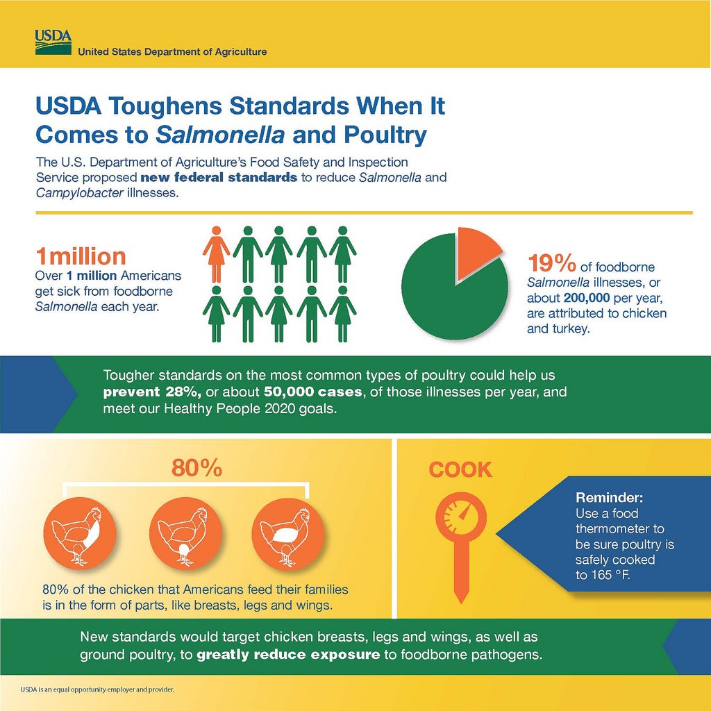
It's a visually appealing graphic that has colors that work well together. The spacing is good and I can see the different headings and sections and nothing is overlapping and confusing in terms of layout. The issue with this infographic is the statistics. I immediately went to the numbers and focused on the "1 million" number and people graphic:
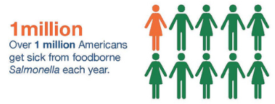
I get the factoid "One million people get Salmonella," however, what I fail to understand is the picture of humans accompanying this statistic. So is it showing 1 in 10 Americans get salmonella? This cannot be correct because it would suggest that there are only 10 million Americans, which seems inaccurate given the total number of people living in the US. One in 300 doesn't seem as shocking as 1 in 10. If we redrew the image it would have less orange. I took a stab at revising it and have the following image, which was a bit generous with the orange:
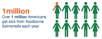
I think the "1 million" is scary enough without the people image and the designers might consider putting a different picture in it's place. How about showing what Salmonella looks like or a general image that means hospital (below). If you were in charge of changing this graphic, what would you choose to do? Additionally, why is the woman figure singled out? Salmonella affects men and women so I do not understand the gender differences in this image.


Data is often misrepresented, not explained fully, or put on an info graphic as a decoration. For example, I saw this infographic about the pedestrian deaths in Southern New Jersey, developed by a group called Info Newt and largely based on government data. I think this is overall a good infographic about pedestrian safety. I can tell quickly where the problem roads are, the ages of people who are in accidents, an that alcohol seems to impair pedestrian judgement.
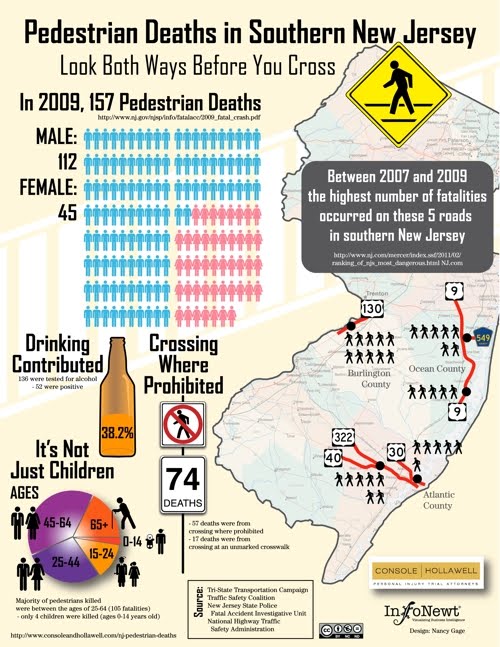
But one of the data visualizations seemed odd to me (below):
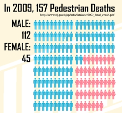
I am not sure how the variable gender is important to this infographic. I can tell that twice as many men get hit than women. Interesting fact, but what does this mean and why is 1/4 of the infographic devoted to showing the gender difference in pedestrian deaths? I am left to my own thoughts as to why this is here:
- Maybe men are more likely to walk in the street?
- Are men more likely to walk around intoxicated (referencing the alcohol issue below this image)?
- Perhaps men are unlucky?
- Do car drivers prefer to run over men than women?
- Are women faster at getting out of the road than men?
- Should drivers be more careful around male pedestrians?
This is not a good situation to be in as an infographic developer. If you are going to devote a good quarter of your infographic to a specific data visualization, it's helpful to clarify why it's there. This reminds me of my days as a student of statistics and advice my dissertation adviser gave me: It's not good enough to present the numbers and findings, you have to make an interpretation of the numbers and how they apply to your research question(s). If you cannot make an interpretation on the data, then I would question why you are including it in the infographic/report/thesis/article.
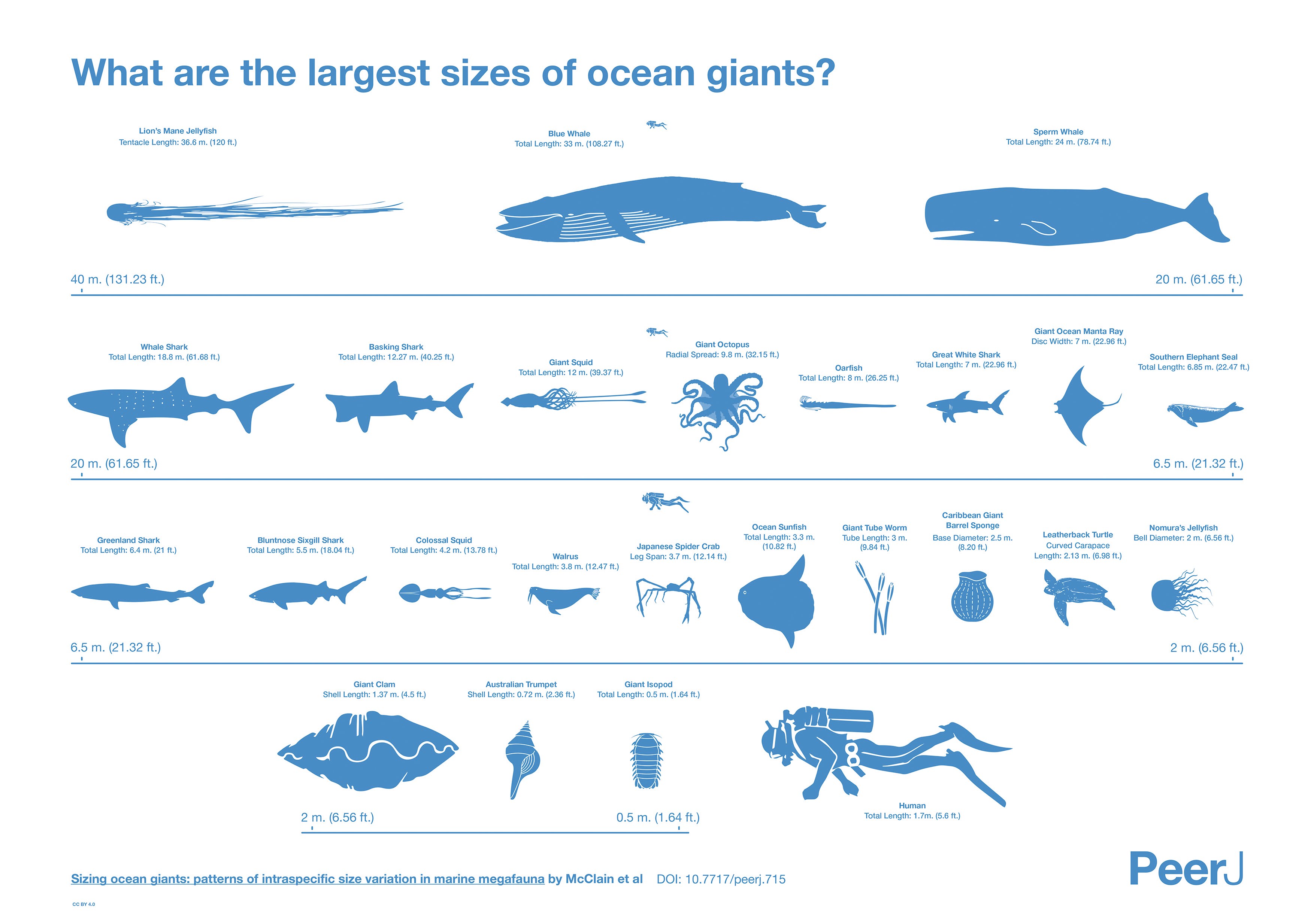
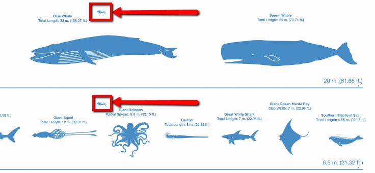
The next infographic has a bit of an image problem and is quite confusing at first glance. The infographic (below) makes it look like humans are about the size of one of the largest mammals on earth, the blue whale (scuba diver in the bottom right compared to the whales on the upper row).
I showed this to one of my colleagues, Carol, and we had the following conversation:
Jennifer: "Carol - look at this infographic, it looks like humans are the same size as whales!"
Carol: "Wow yeah that's waaaaay off!
Jennifer: "I guess some days you can feel like a whale and you probably wouldn't want to look at this!"
Carol: "Wait ... look at the middle of each row, there's a small image of a diver ... oh that's the size comparison they are making! There's a tiny diver in each row!"
Jennifer: "I didn't see that - it is so small and I thought it was a logo or something."
Carol: "So a giant clam is the size of a human?"
Jennifer: "Wow I don't know, but I am not sure if I trust this infographic though."
https://www.flickr.com/photos/truliavisuals/5241592552
In case you're wondering, giant clams are around the size of humans.
Ideas for Visualizing Data
Visualizing data is not easy and if you haven't represented data in a graphical form then you might feel a bit limited in how you can visualize a data set. For example, I know there are bar charts, histograms, pie charts, linear correlations, tables, and other standard forms of data representation. I think these do have a place in infographics and should be used; however, infographics tend to be more "catchy" than standard statistical charts. One way to think about data visualization outside the standard representations is to look at several creative ideas:
- This website is a link to other sites that feature creative visualization. Some sites, such as many eyes, is a collection of user ideas.
- Get a Pinterest account and search for "creative data visualization." There are numerous "pins" that have ideas for representing your data.
- Find tools and play with them to see how they present your data. I have listed a number of resources I like in your weekly readings as well as in your infographic assignment. Think of some data that you would like to represent and play around with the tools and get ideas.
Graphics and Presentation Design
I designed an interactive on how NOT to do a PowerPoint presentation and many of these design elements also apply to infographics. Here is a link to this interactive. Please take some time to go through the examples and employ them in this assignment, and also other presentations that you build for other classes.
is a huge issue when it comes to developing an infographic. As a designer, knowing about the color wheel is very valuable so you can pick a good color scheme to represent your data. One major color scheme you want to avoid is monochromatic. In the whale example above, there is too much blue. Blue is a great color choice and is representative of water, where the creatures live; however, when it's all blue the mini divers used as representations are difficult to see. If the mini divers were orange (a complimentary color to blue) I might have noticed them a bit more.
So how do you pick good colors? There are many color wheels online and one of my favorites allows you to play with colors and see what happens when you change one of the numerous variables. If you search for "color pickers" there are many other tools that you can experiment with to find a color scheme that works best with your infographic.
Another issue is typeface, or fonts, and what typeface will compliment your data and graphics. It's difficult to choose a typeface and sometimes I will agonize over what type I should use for a presentation. I have one general rule that I always use, which is use a serif font title and sans-serif font for the text body. A serif font has extra tags on the letter endings, where as sans-serif is plain. Here is an example of a serif and sans-serif font:

There are further decisions that need to be made when choosing a typeface. One of my favorite resources is Smashing magazine and here is a good article on typeface considerations.
For this week, view as many infographics as possible to get good ideas for data visualization and also find bad examples that you want to avoid. Additionally, have fun experimenting with typeface and color and enjoy matching up these graphical elements.